
Project Title
Battle.net Product Page Redesign
Project Timeline
October 2020 July 2022
STATUS
Paused Q4 2022, unreleased
Project Detail
The Shop Product Page was the last page where users received product information before checkout, which made it the last chance to give them a full understanding of what they were buying.
My Role
I joined mid-research and owned the design from that point on, with the Design Lead reviewing. The initial discovery was already underway when I came in; I inherited it, made every design decision that followed, and produced the design end to end.
That included deciding which findings to act on and which to set aside, phasing the rollout around regional legal requirements, running the stakeholder workshop and filtering its output, and testing the direction with users before handoff.
This case study covers Phase 1 of a three-phase plan.
Background
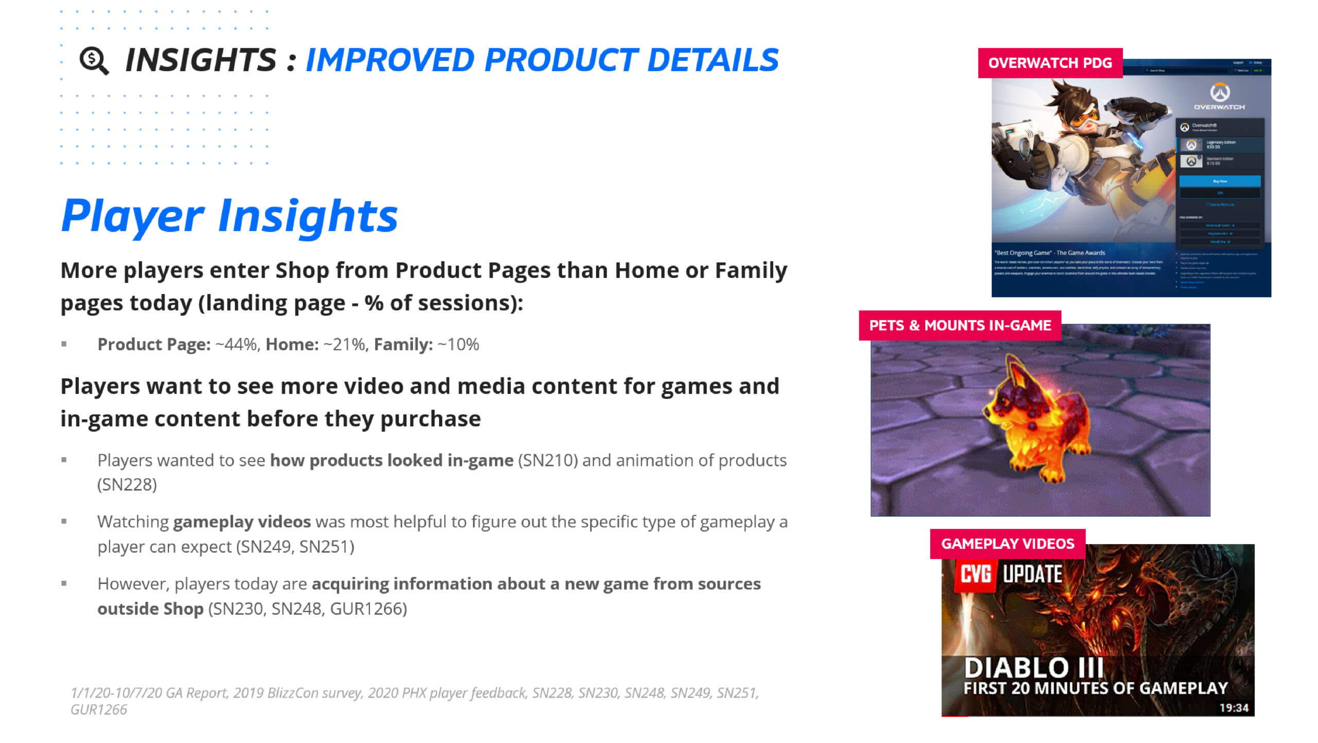
44% of the visitors enter Battle.net Shop to Product Page, 21% to Home Page, and 10% to Franchise Page. While 44% is an incredibly high number, the purchase rate was at 46%. Senior leadership saw the importance of improving the Product Page and gave our team a mission: ‘How can we increase the purchase conversion rate?’.
STEP 1
Understand Product and Surroundings

What is Product Page?
The Product Page was the last page where users could learn about a product in the Battle.net Shop before checkout. There were 11 different sales cases at the time, with more product types expected: Box Products, Single Products, Free Games, Partial Free Games, Multi Quantity Products, Virtual Currency Purchases, Battle.net Balance Purchases, Subscriptions, In-game Item Purchases, Mobile Products, and Mobile & PC Cross Platform Products.
The page was assembled from several components: Background Image, Videos, Purchase Panel, Product Details, Title & Descriptions, and Modules.
Deciding what to prioritize was difficult because Battle.net was not the only place this information lived. Game sites, mobile apps, and Blizzard.com all carried product information, so the first question was what belonged on the Product Page and what belonged elsewhere.

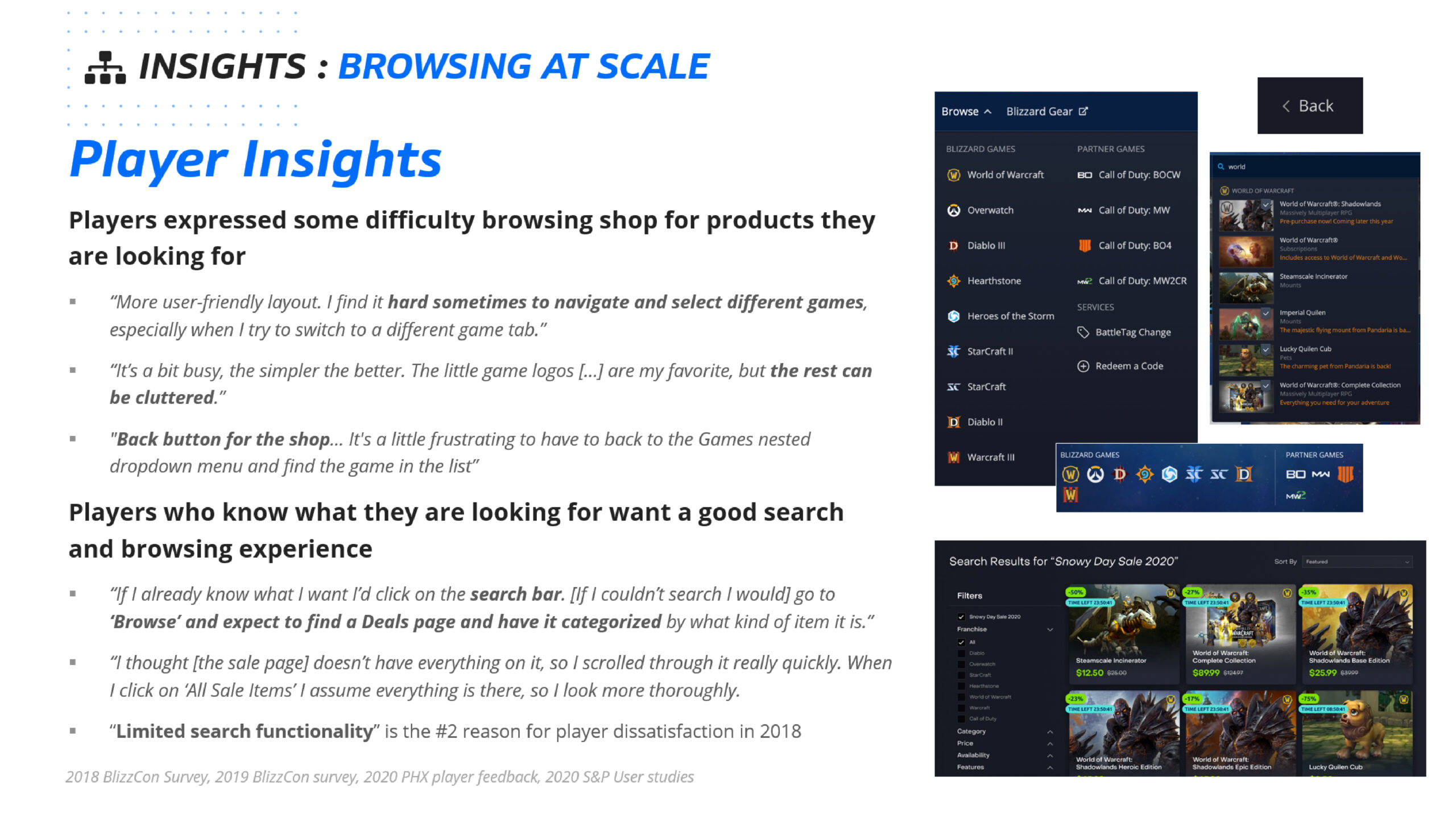
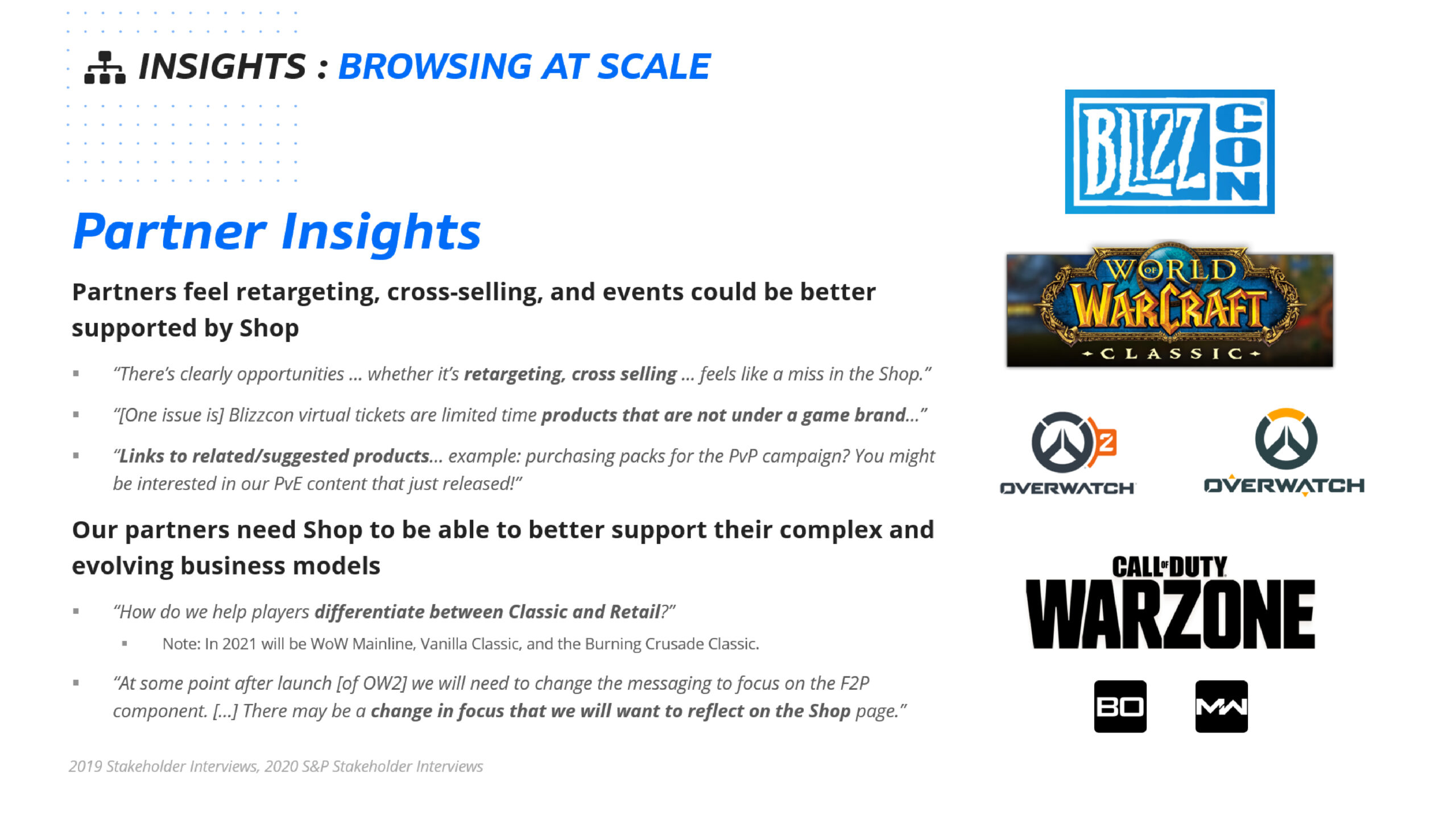
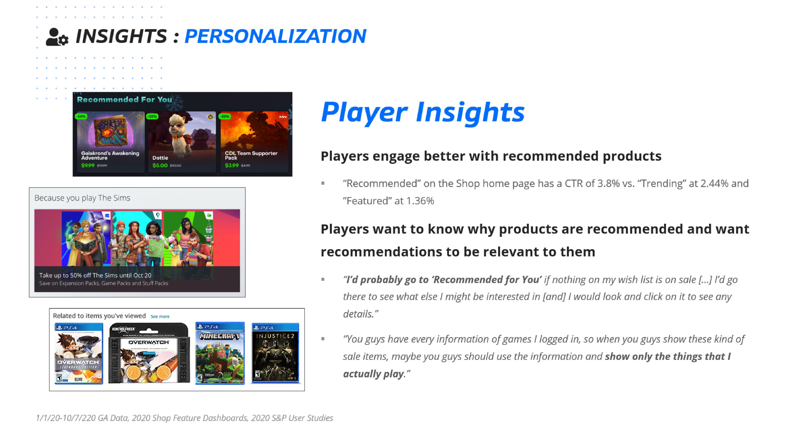
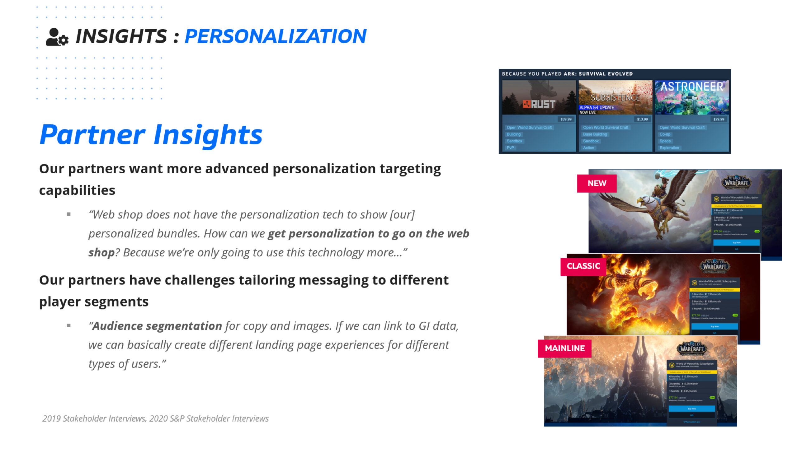
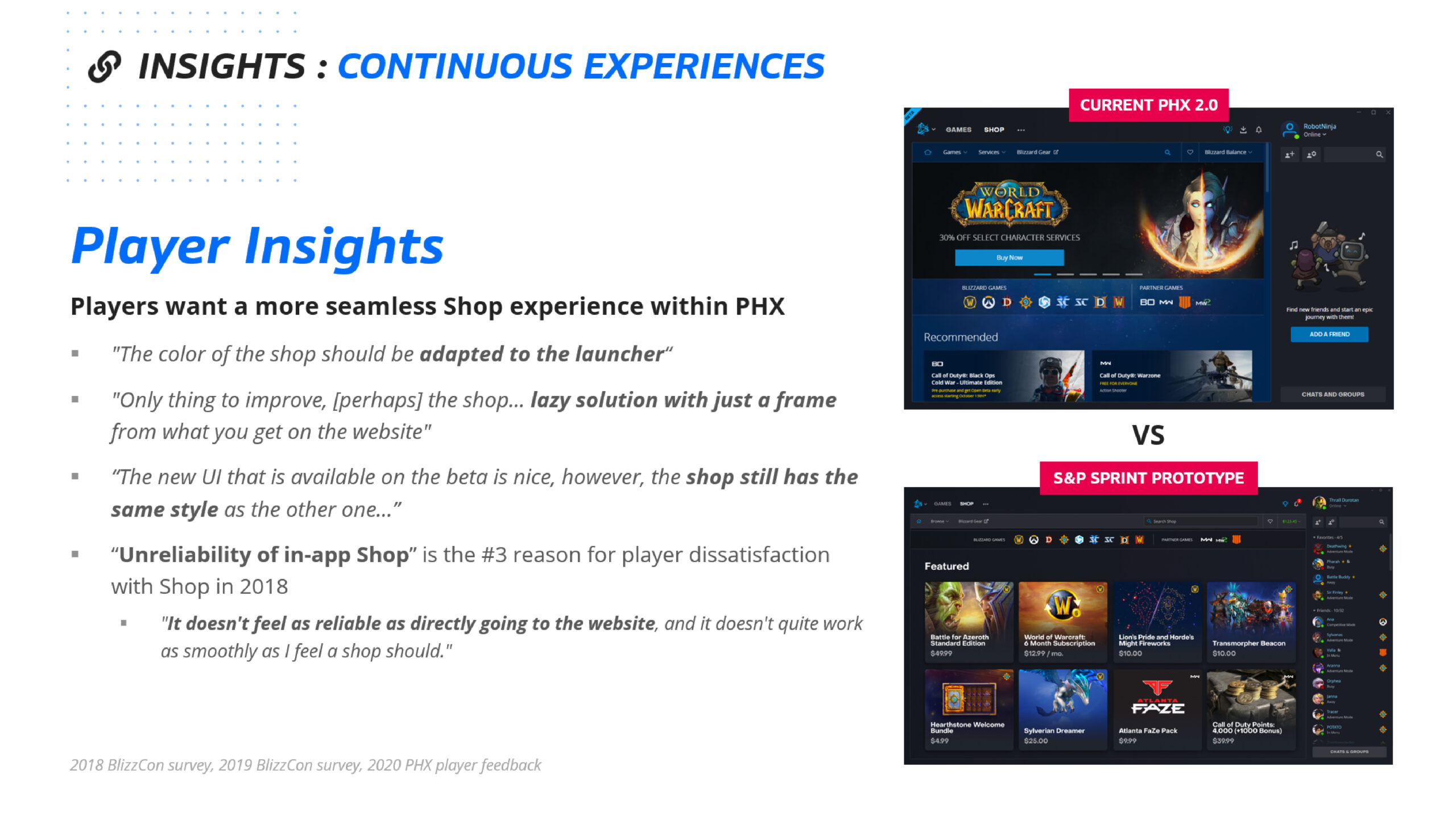
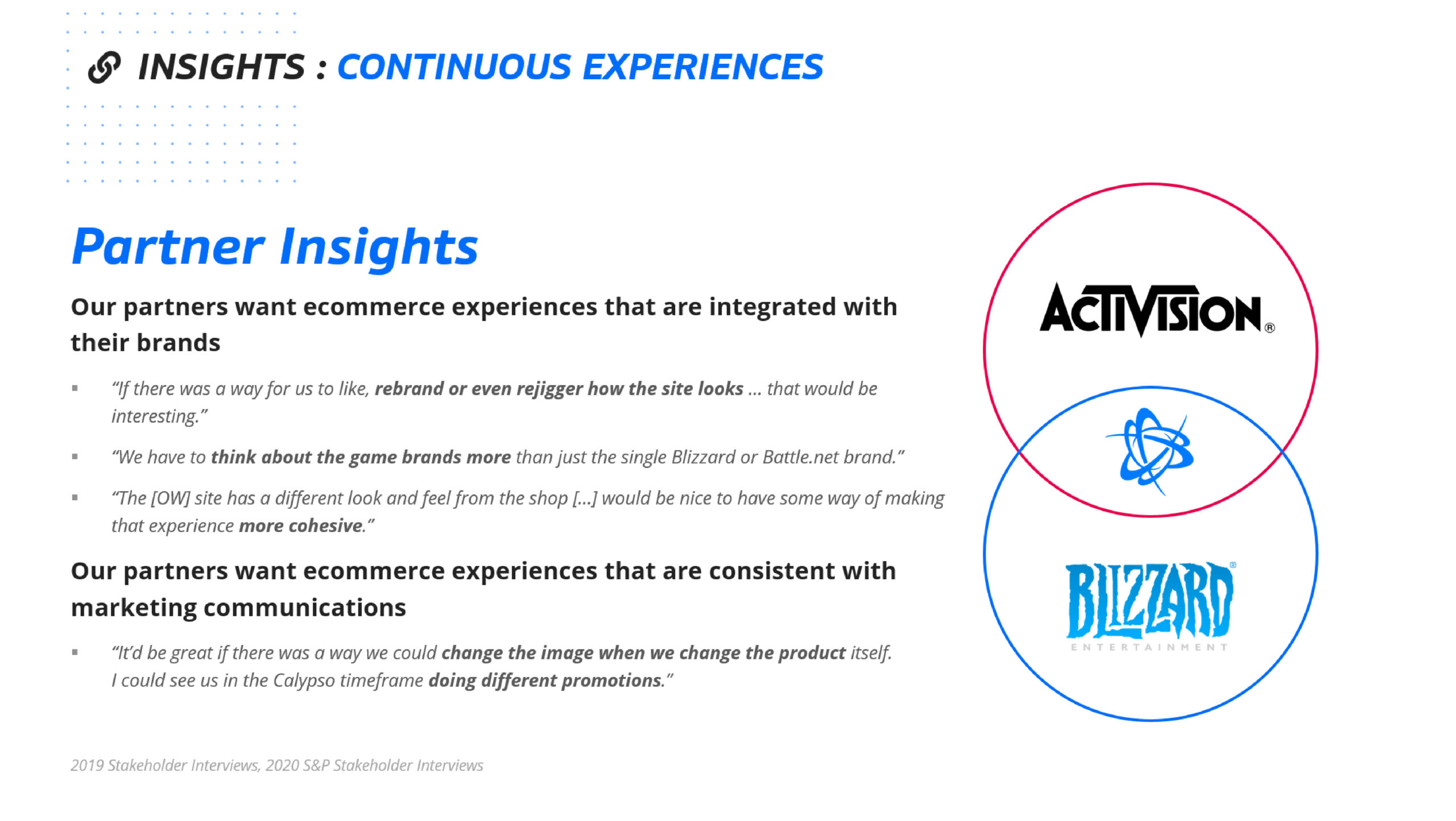
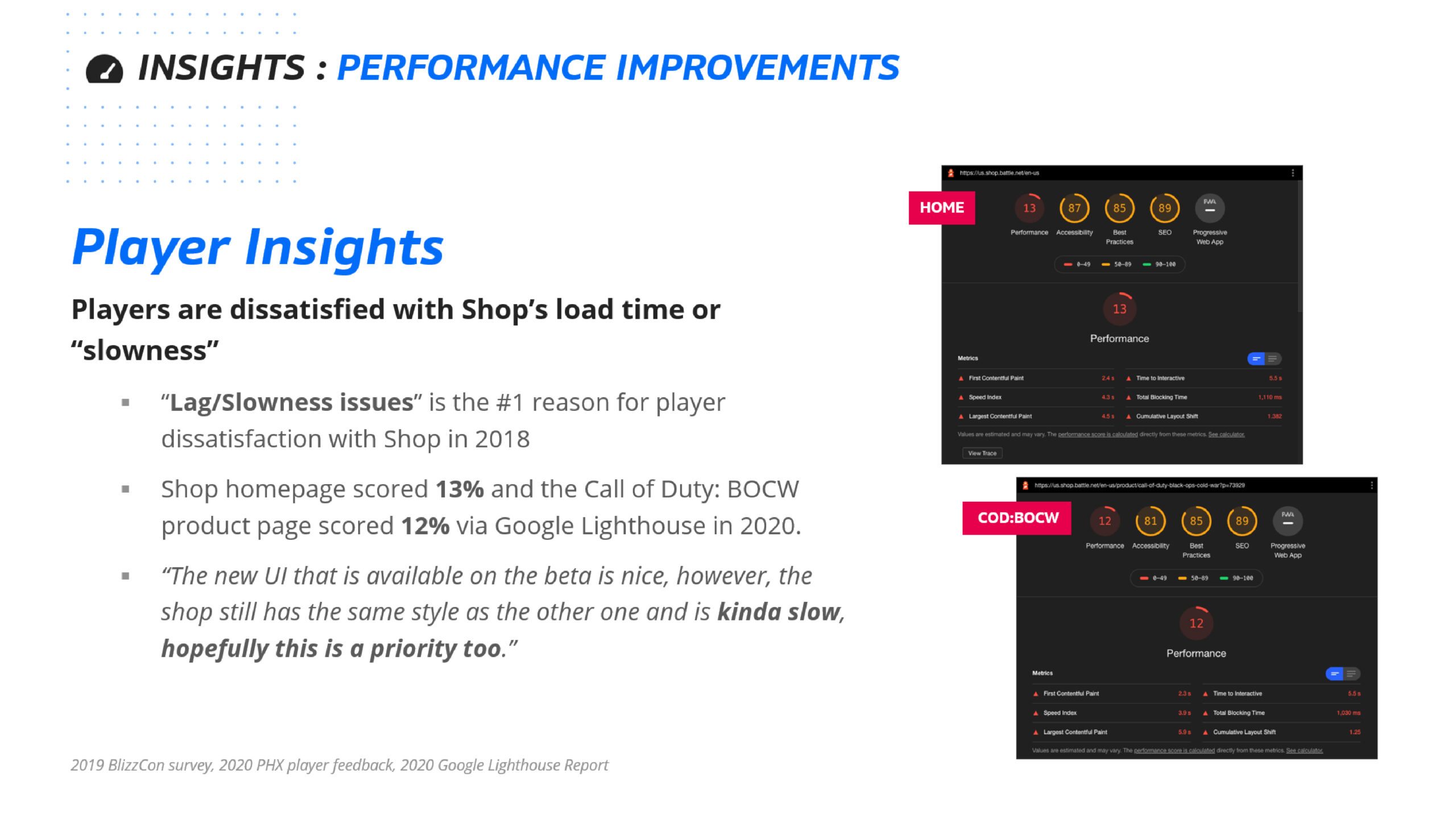

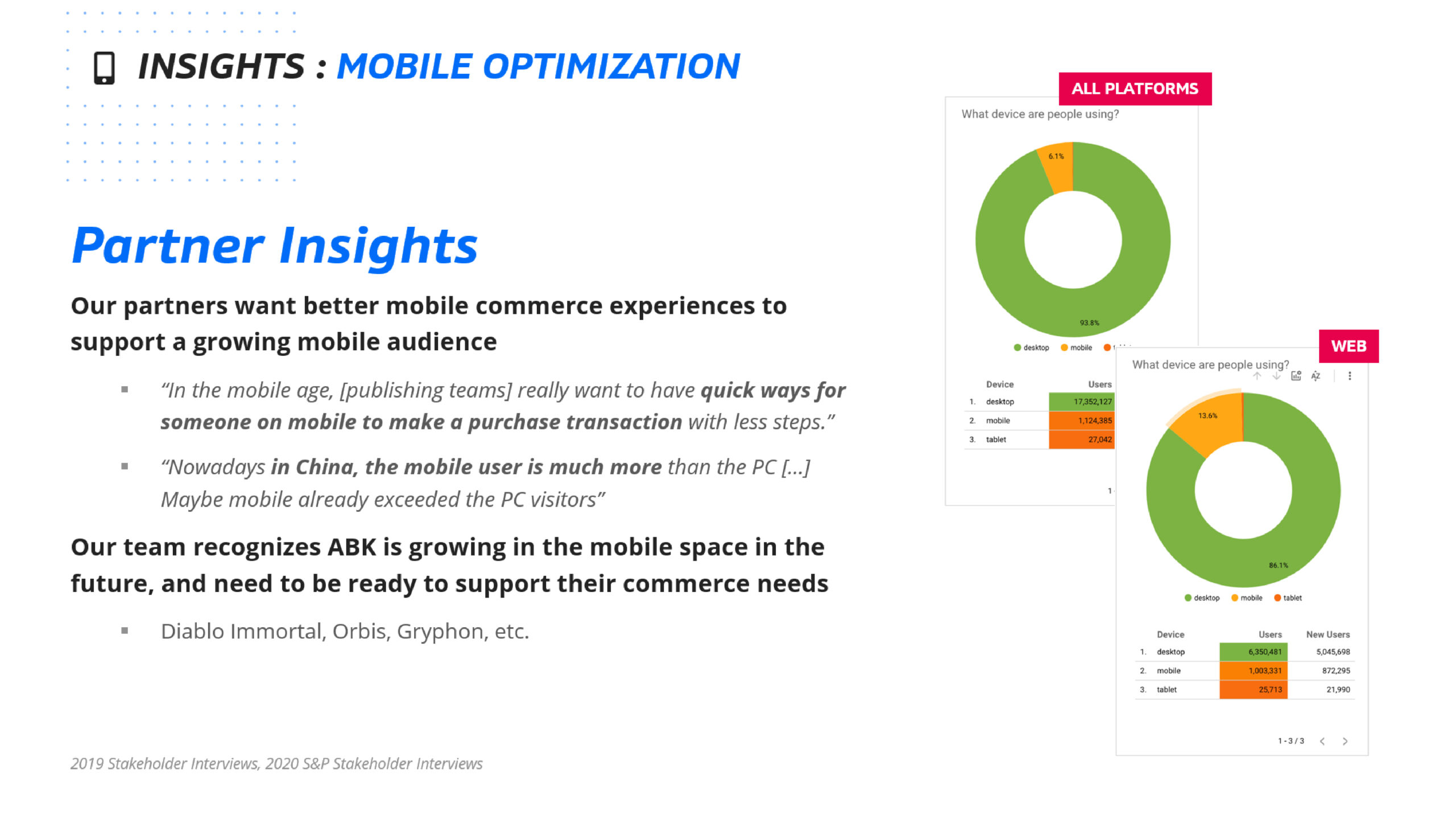
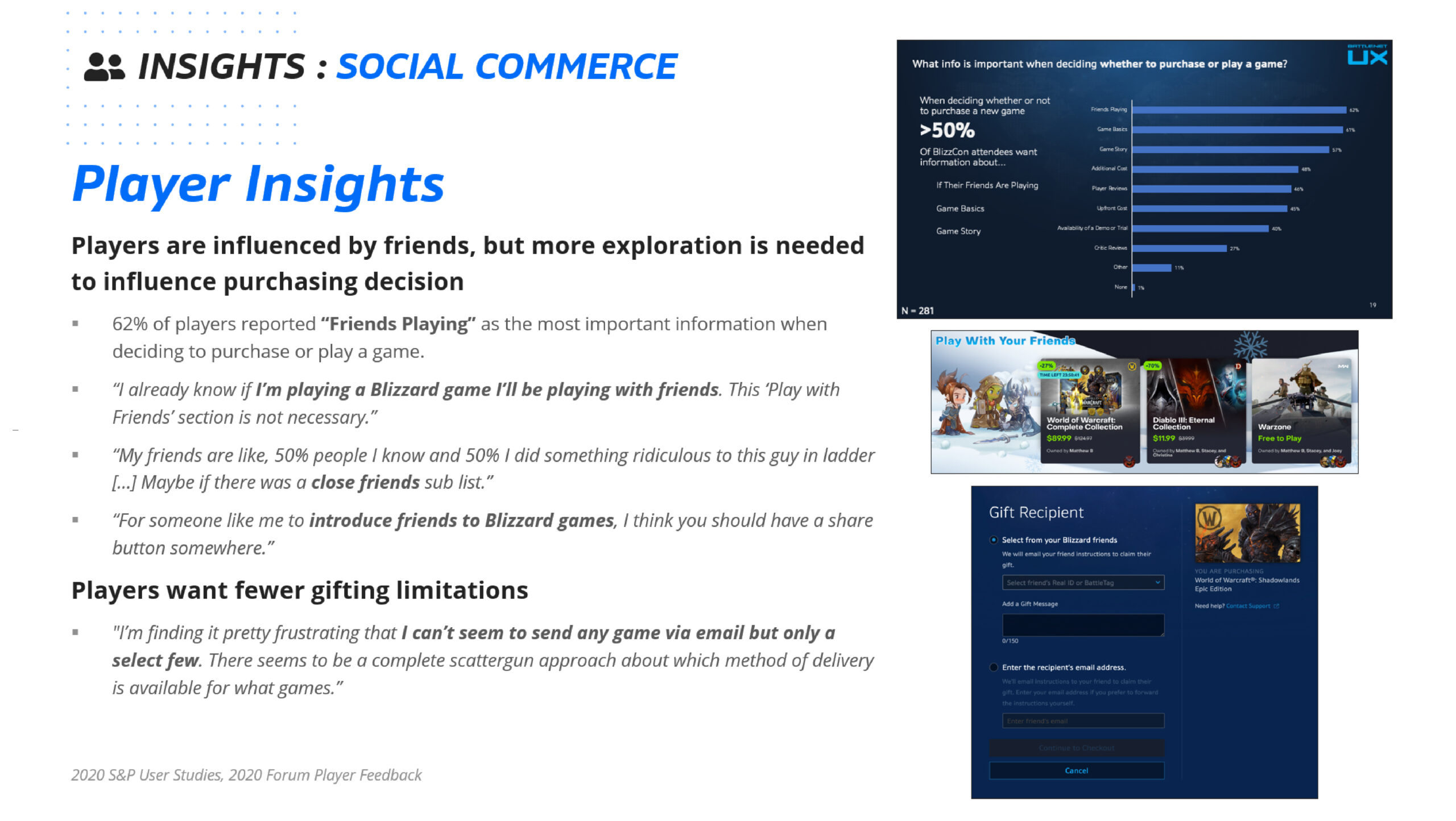
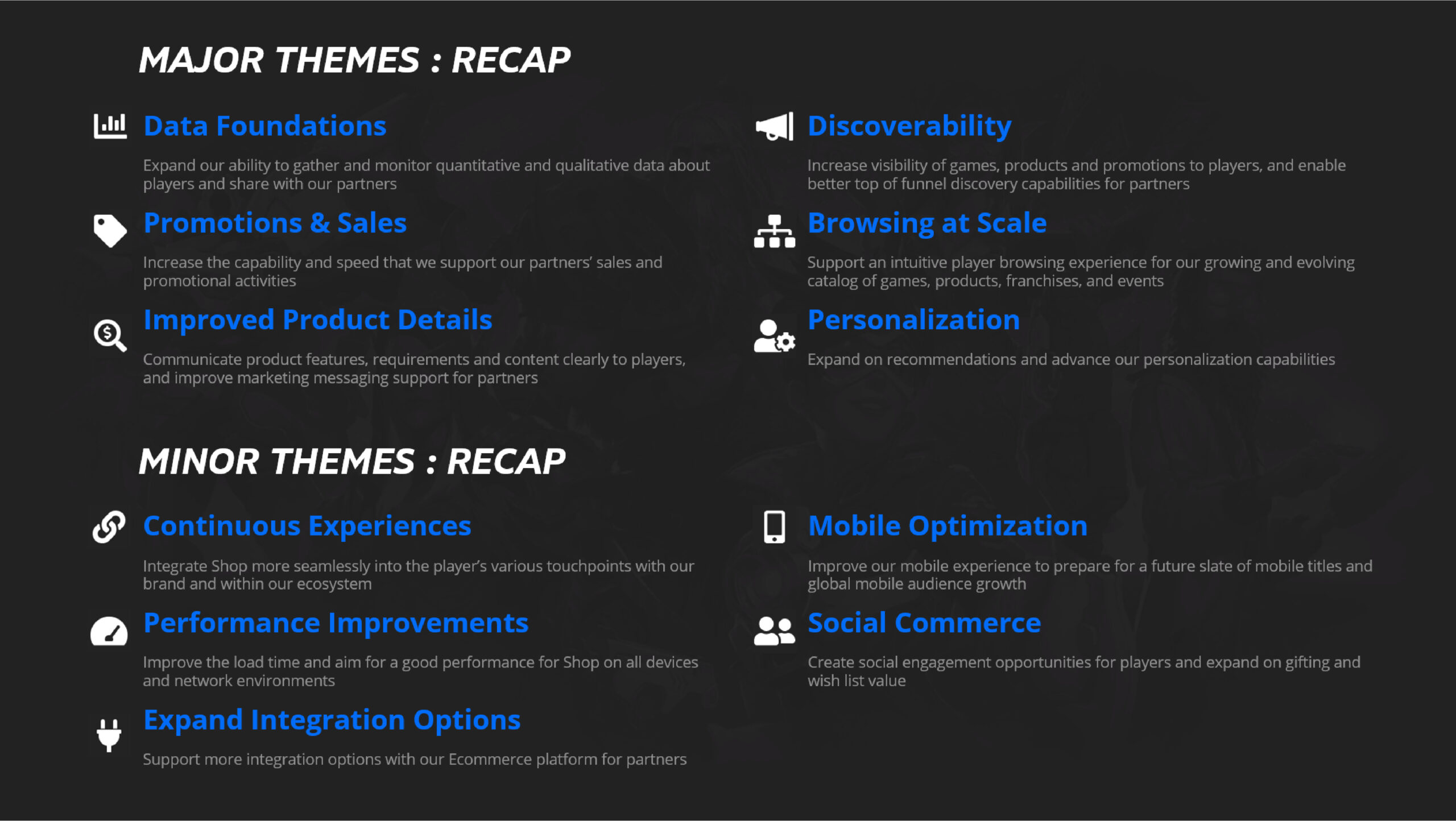
Macro Research; Improve Product Detail
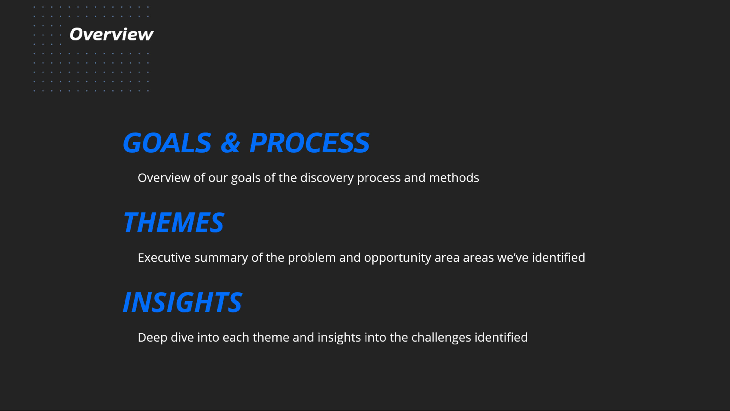
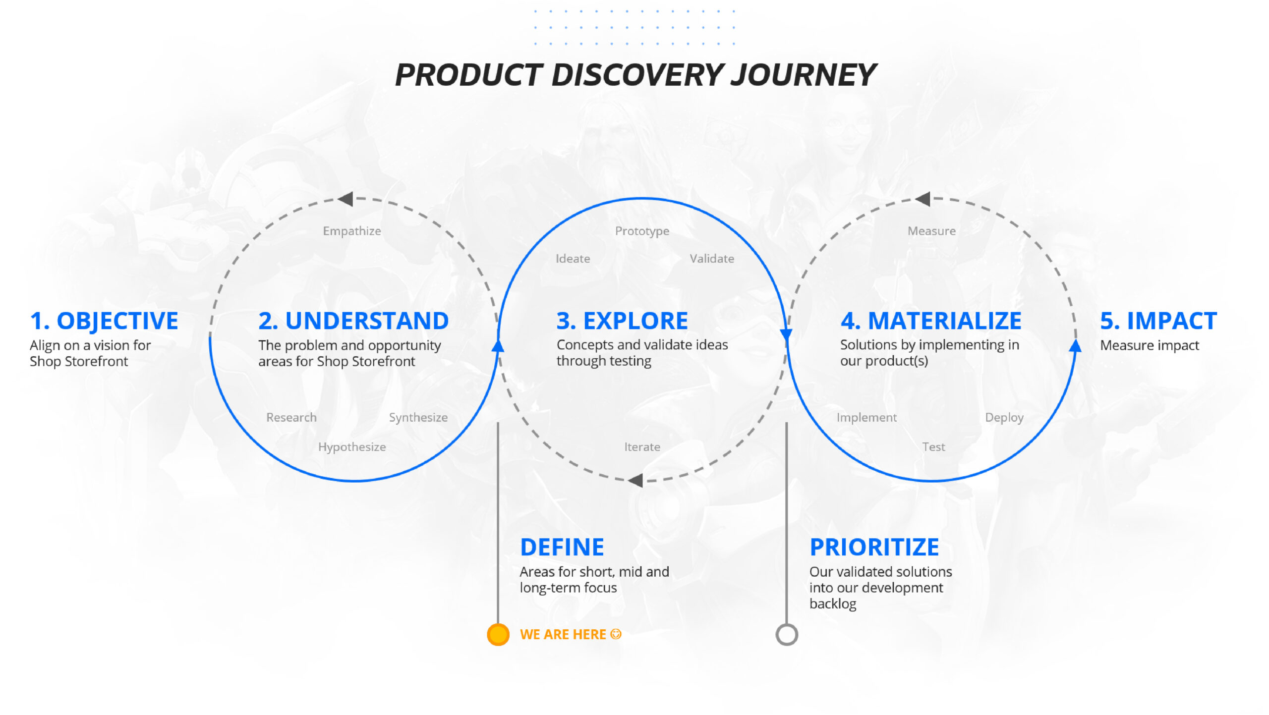
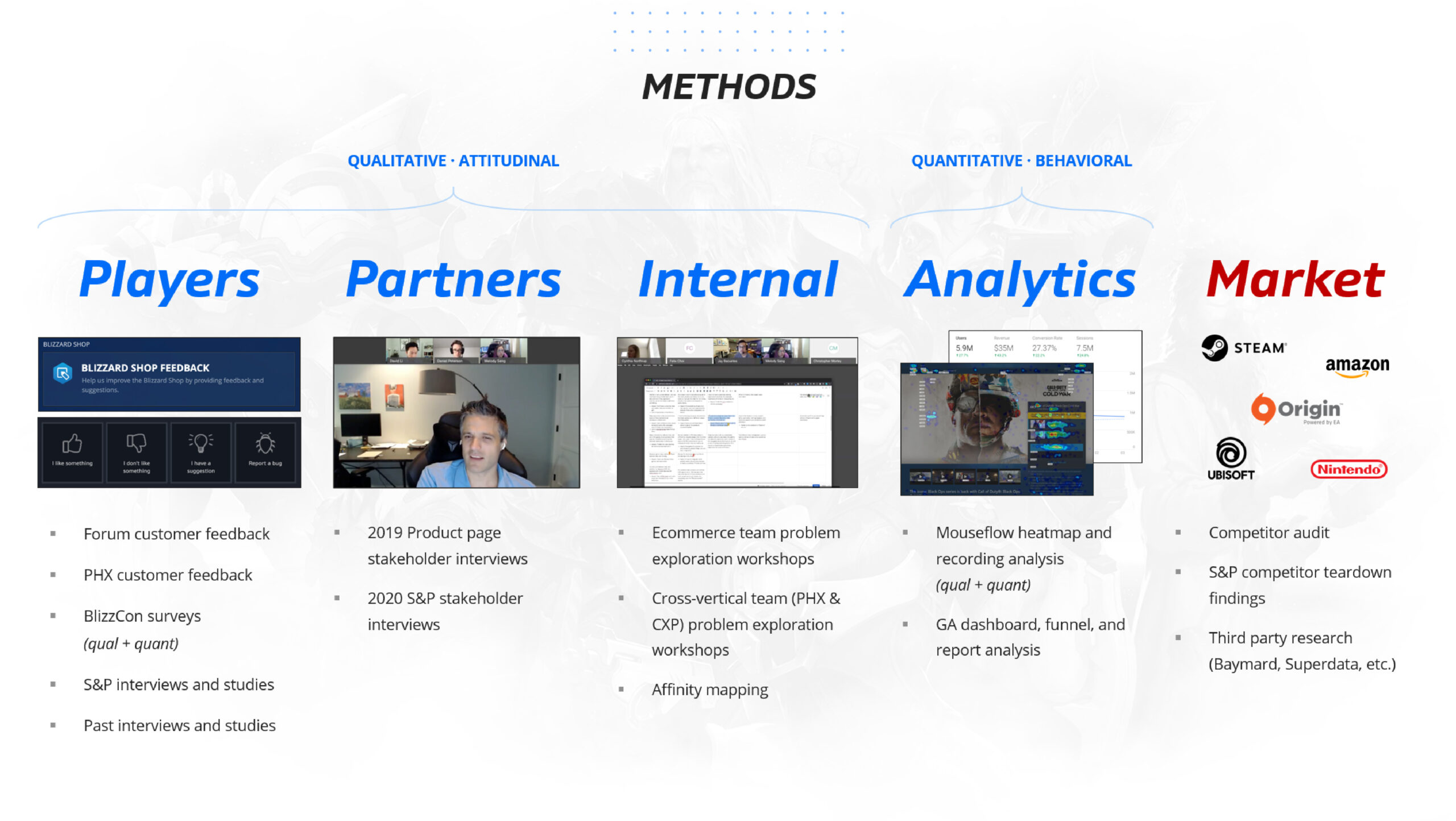
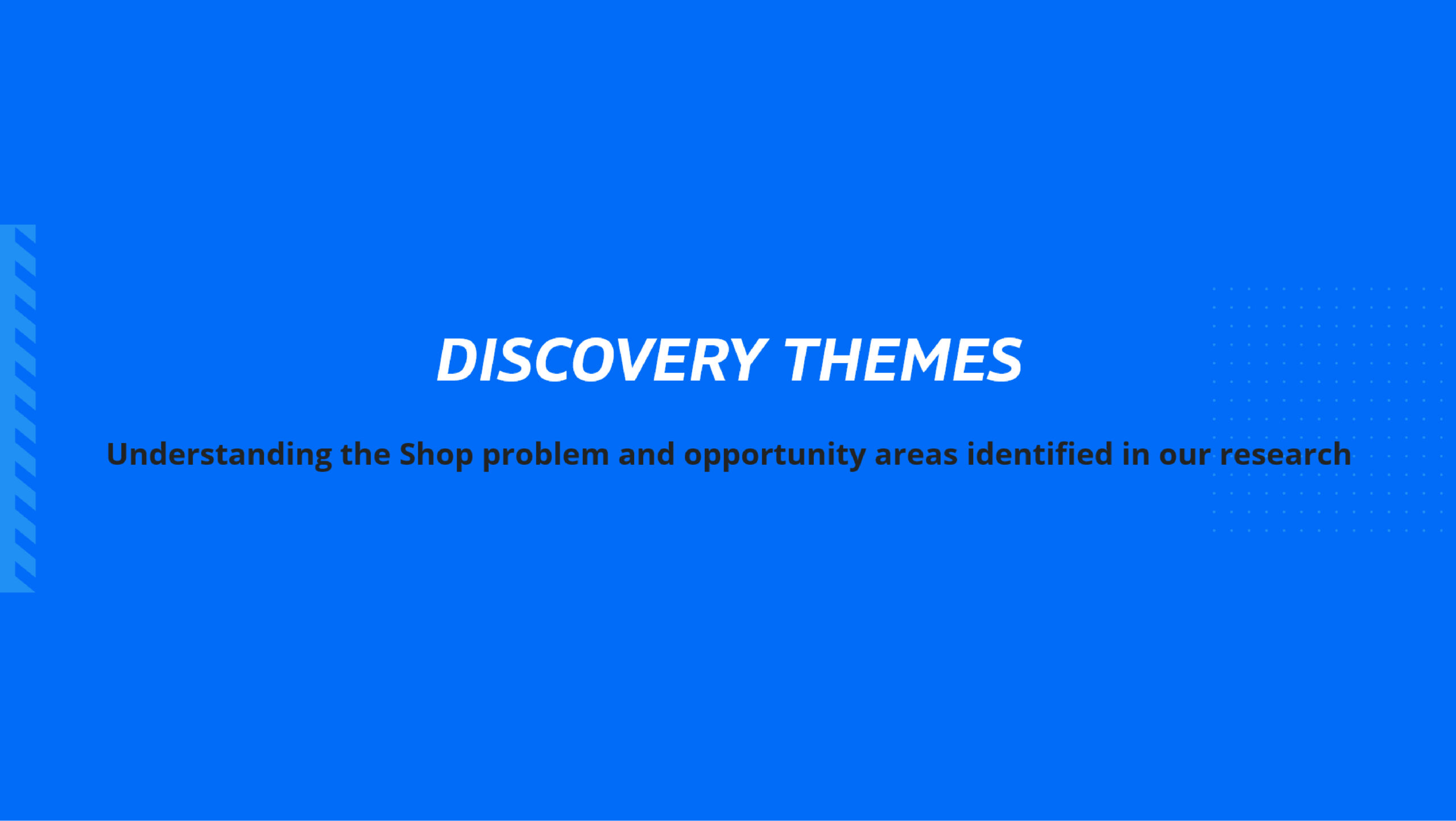
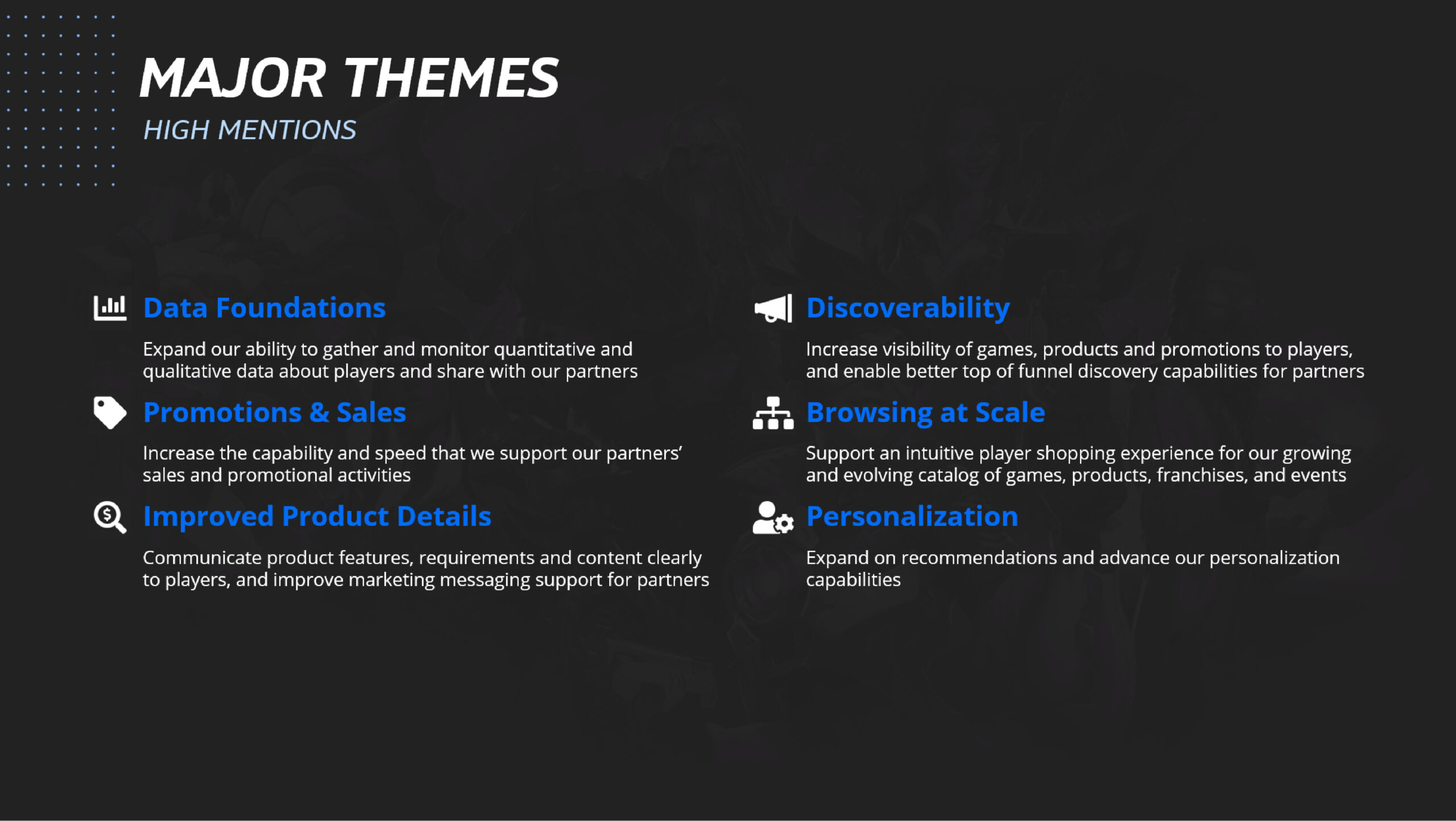
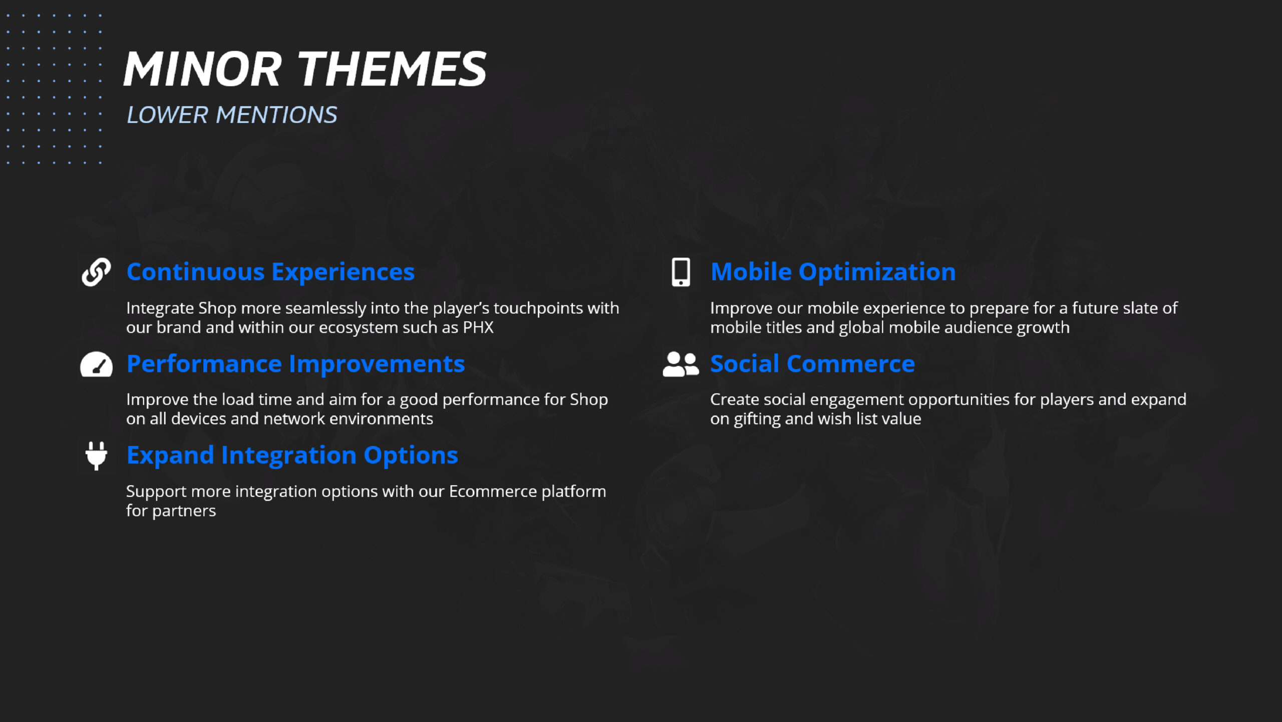
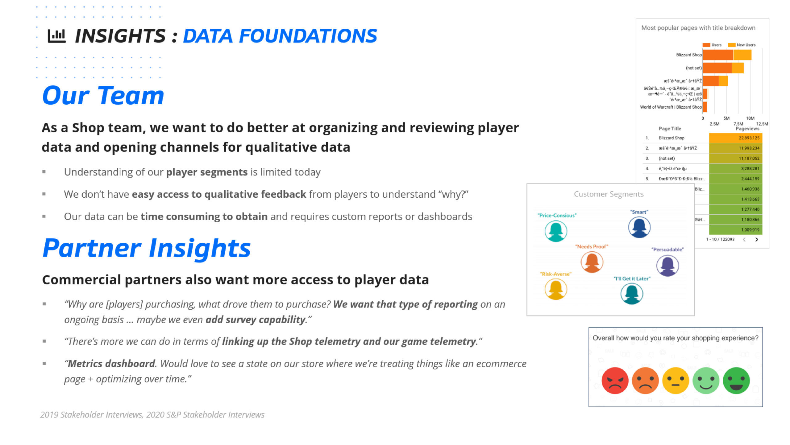
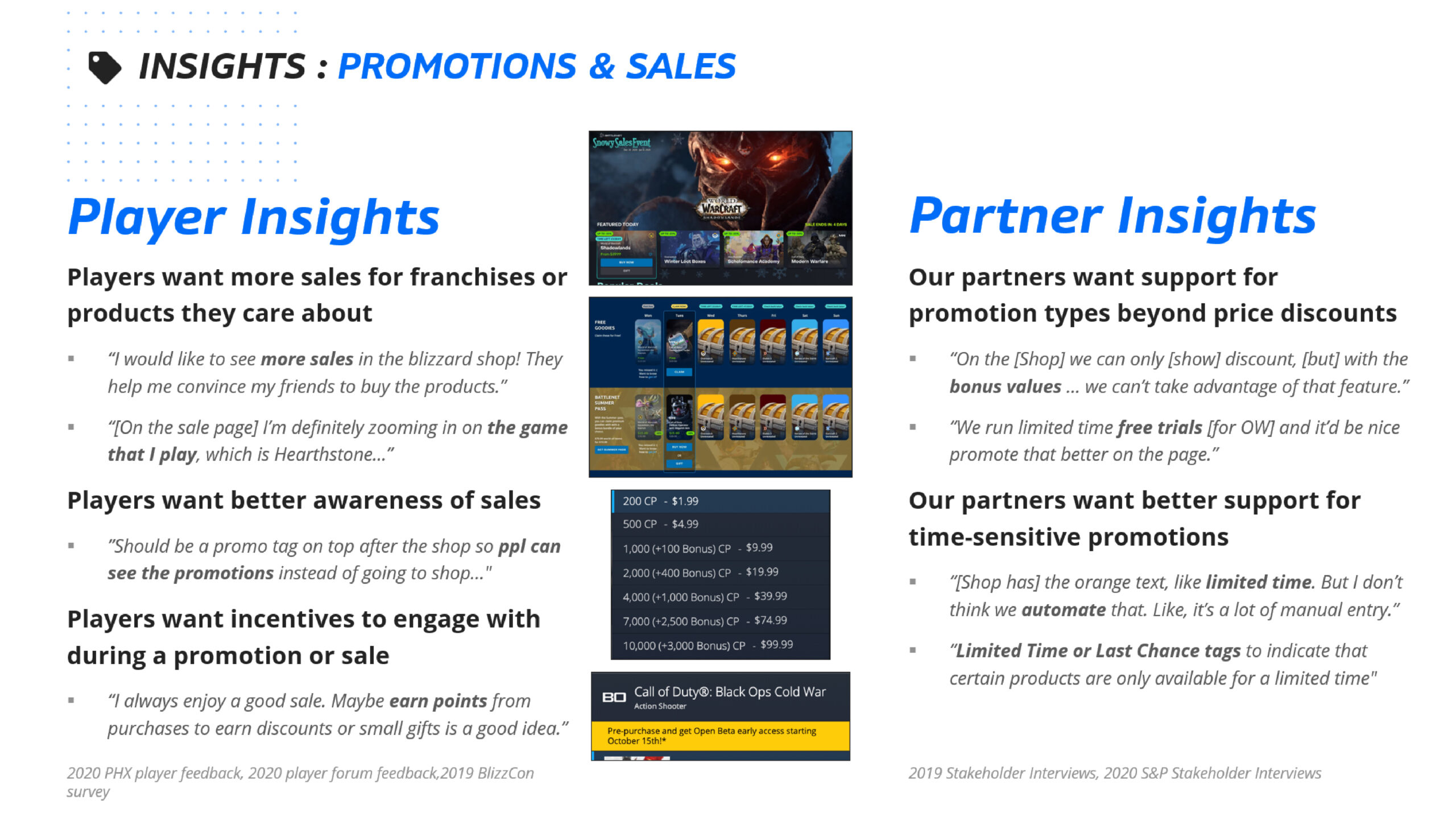
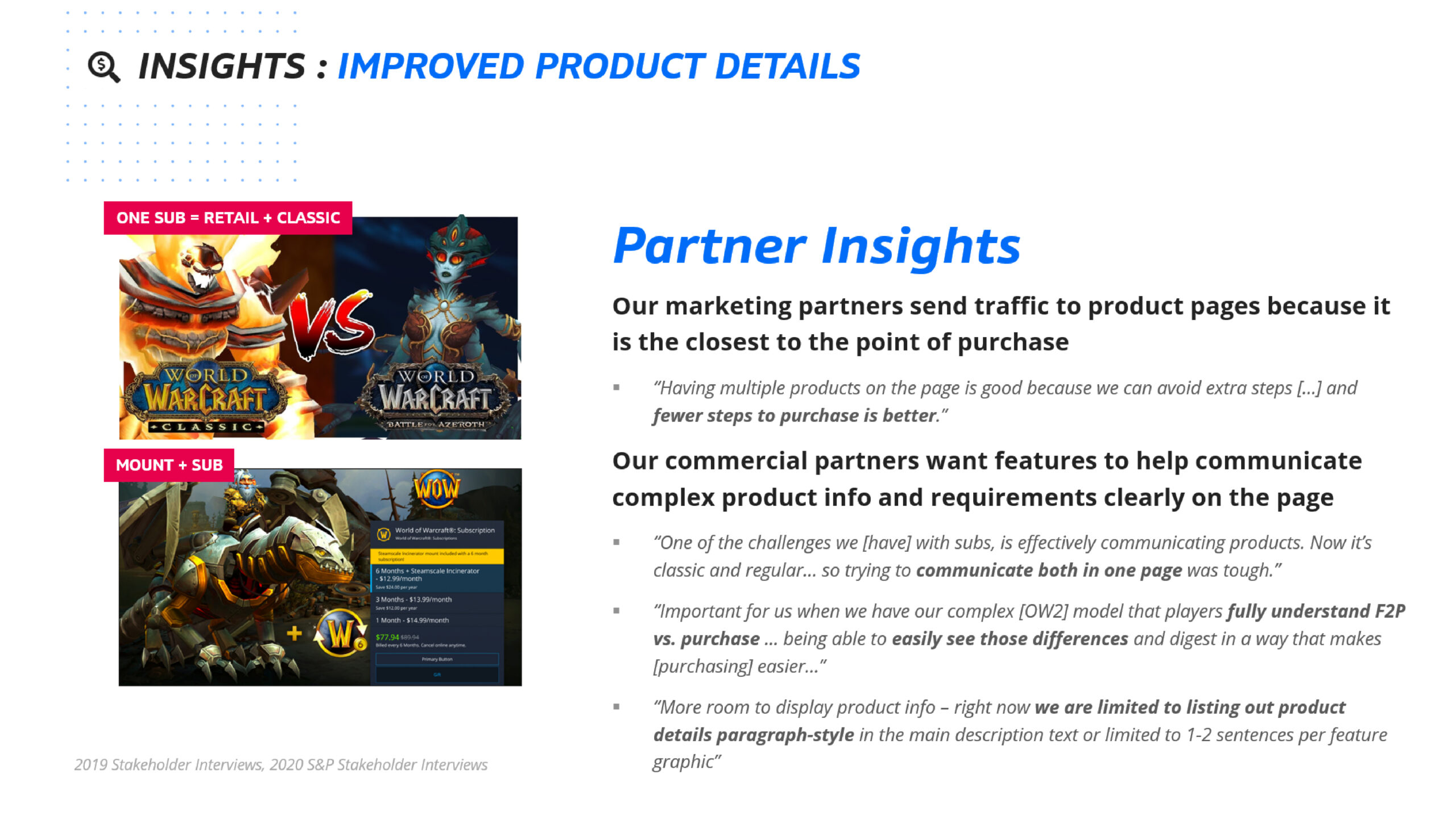
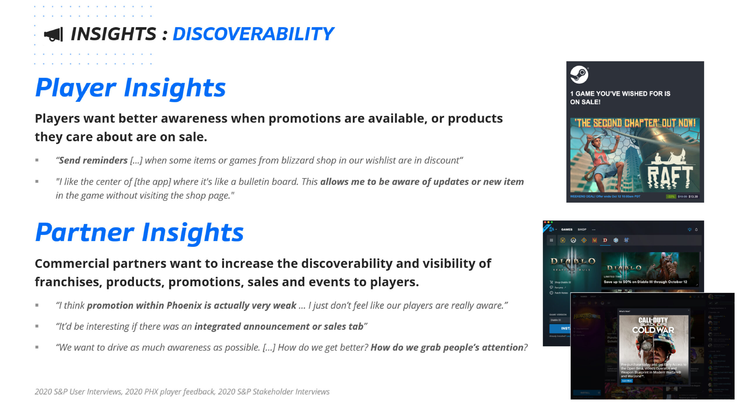
In 2020, there was a macro research initiative to discover high level Battle.net Shop problems before this Battle.net Product Page Redesign project began. The purpose of this research was to inspire Senior leadership with design direction.
Battle.net Product Page Redesign (also known as ‘Improve Product Detail’) was one of the major problems discovered during the research, which led to the launch of the Battle.net Product Page Redesign project.

Organization, Flow and Structure
I started by analyzing the existing research and running a comparative analysis against other storefronts, working with my Design Lead and PMs to establish priorities and scope.
The conclusion was that the Product Page could not be approached as a single item, for three reasons:
- The scale of the page was too large and the root causes were intertwined with one another.
- There were 11 variations of sale types, and target user behavior differed across them.
- Each module was supported by a different tool, and ownership of those tools sat with different partners and stakeholders.
We needed a new plan.


Project Planning
Product Page was a large scale project with both design and development. The team decided to break down the design aspect into different phases.
Phase 1: Improve Purchasing Experience
- Product Page Header Structure
- Image Display
- Purchase Panel
- Legal Information
Phase 2: Improve Browsing Experience
- Redesign Product Page Flow
- Create Product Page Navigation
Phase 3: Improve Learning Experience
- Discover & Improve Contents
- Module UX Improvement


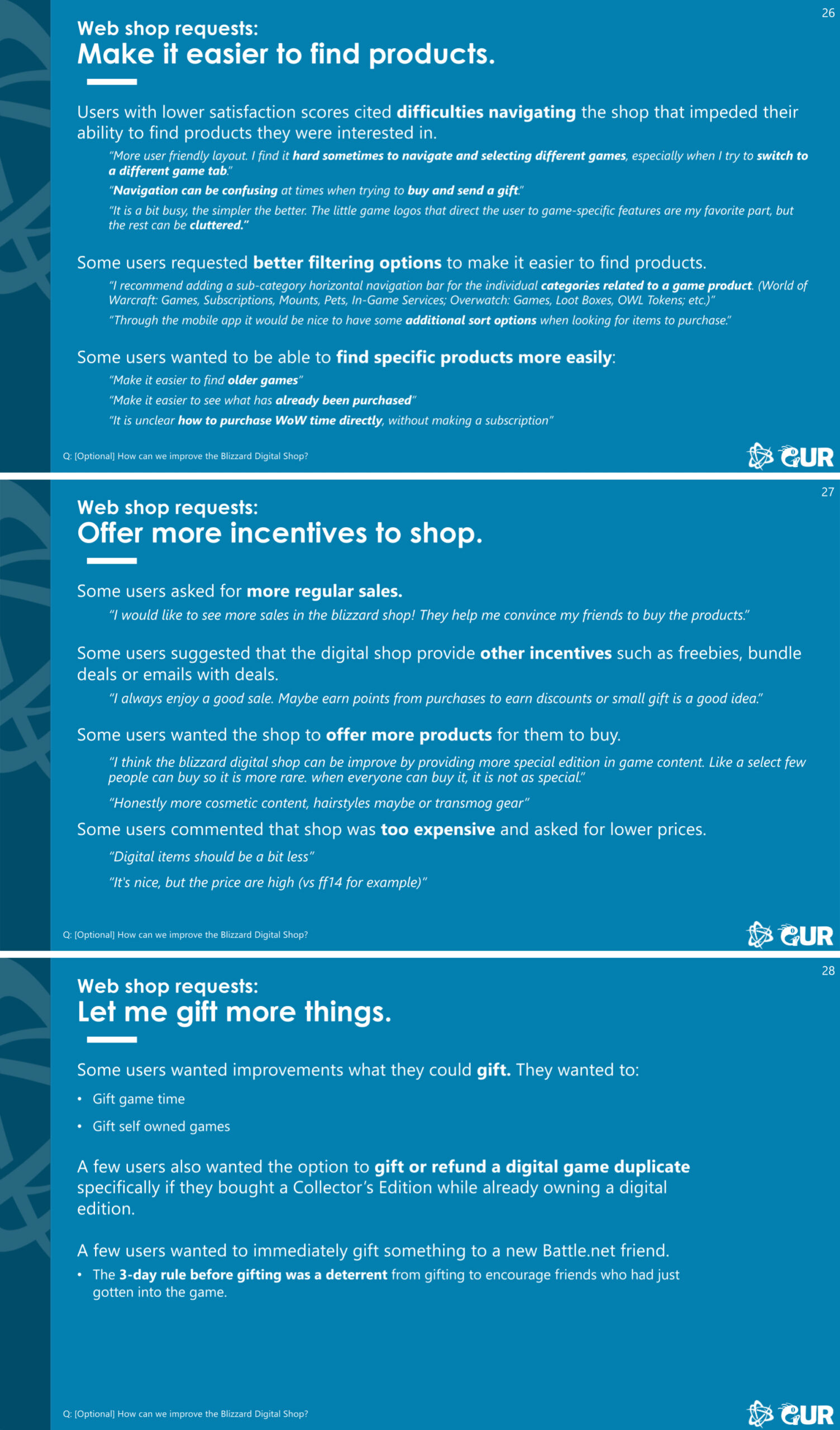
2019 Blizzcon Survey

Heat Maps (Click, Movement and Scroll)
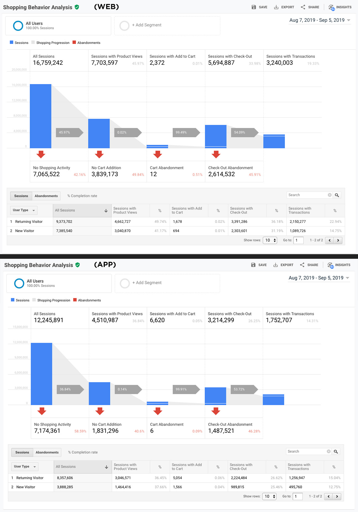
Analytics Research
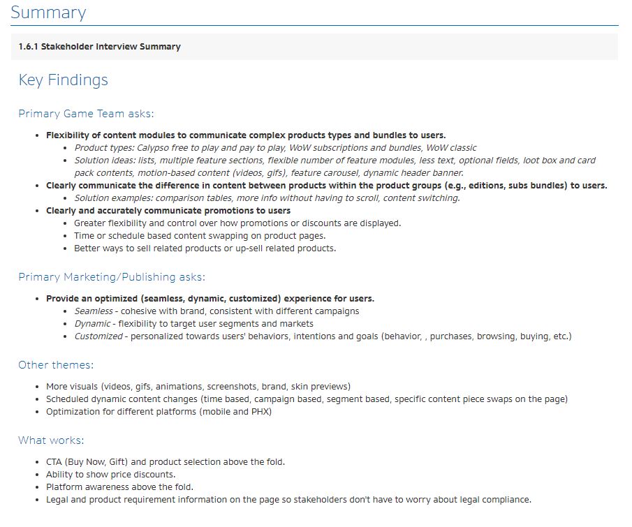
Stakeholder Findings
Purchase Panel Problems & Insights
Real Estate on Purchase Panel
- There were over 11 sales cases in the Shop, and the fixed structure of the purchase panel could not accommodate all of them within one template.
Information Hierarchy and Storytelling
The panel did not clearly communicate sales and promotions: bundle discounts, sales discounts and bonuses, free item promotions, or subscription savings.
- The difference between product Editions inside the purchase panel was not legible at a glance, particularly for game products, and the path to the product comparison page was hard to find.
- Several design elements were no longer serving the purpose they were originally built for.
Lack of Flexibility on the Current Design and Tool
- The Shop expected more hybrid and unique sales cases in the near future, and the existing design had little room to support them.
Product Requirements & Legal Disclaimers Problems & Insights
Information Hierarchy and Real Estate
- Product requirements and purchase disclaimers consumed valuable real estate directly under the purchase panel.
- Because the information was not tied to each individual product, it was often inaccurate for the product actually being viewed.
- Requirements and disclaimers were unorganized and mixed together.
- The page lacked the real estate to separate them, which broke down further in regions with more complex legal requirements.
High Potential Human Errors when set up
- All product requirements and purchase disclaimers were set up manually, which made inconsistency likely.
Product Page Problems & Insights
Information Hierarchy and Storytelling
- Users were not fully informed about a product before purchase.
- For expansions, users' relationships to the base game created assumptions about returning to WoW that no longer matched the current game.
- Stakeholders across teams had different goals for communicating their product information, and a one-size template could not support them.
- Users did not engage with blocks of text in Shop pages and preferred visual information.
Support for Sales and Promotions
- Stakeholders wanted a more automated way to communicate promotional details beyond price discounts.
- Stakeholders wanted to surface time-sensitive marketing information to users.
Lack of Flexibility in the Tool
- Stakeholders wanted a faster product page setup that required fewer resources and could adapt to changing variables.
There were more issues than this, so I prioritized the ones with the widest impact across categories.
How Might We...
Help Users Learn About Products
How might we create a product page that is capable of communicating the vital information in a logical, intuitive way to the Users to assist in making a decision?
Increase Flexibility to Support All Product Types
How might we create flexible and scalable product page templates that offer consistent shopping experiences for the Users that can support current product types and support future business cases?
Improve Utilization of Page Real-estate
How might we create product page templates that optimize page real estate and clearly display product information?
STEP 2
Product Page Ideations and Design Explorations


Workshop and Design Explorations
The Workshop Participation
Partner and stakeholder participation in ideation workshops is valuable for two reasons. It avoids surprises and unworkable directions late in the process, since people without a design background often cannot read a low-fidelity mockup the way a designer can. It also gives partners a stake in the outcome, and it surfaces their preferences early enough to design around.
Where Workshops Break Down
There are situations where a workshop does not produce the best solution.
First, I have seen designers treat workshop output as the final direction because it came from partners, stakeholders, or decision makers. But when I ran these workshops, the non-design disciplines rarely connected with the Problems & Insights or the How Might We statements, because they had not been part of problem discovery. When the problems are complex, they resist being compressed into a couple of sentences, and the link between problem and solution never forms in the room.
Second, everything is scribbles at this stage, so the more eye-catching drawing draws attention regardless of what it proposes. Fancy visuals collect votes.
Third, some participants optimize for interesting ideas rather than for the problem. They bring in patterns they liked from other platforms that share none of the same constraints. This happens when participants do not fully understand the problem or the purpose of the session.
Design Mockup ideations
I composed and presented a wide range of mockups. Not every direction was viable, but putting the full range in front of partners and leads gave them something concrete to react to, which surfaced constraints that had not come up during research.
Step 3
Final Design


Old Product Page Design
New Product Page Design
New Battle.net Product Page
New Image Display Interaction
Image Display
Old Product Page could not support multiple image/video assets at a glance. The new design has smooth connections between multiple assets with easy navigation. Also, the Image Display is interactive to the Purchase Panel. When Users select different product editions on the Purchase Panel, the display will show other associated images to help the Users clearly understand the product.
All the images displayed on the Product Page now are 16:9 ratio. Partner teams no longer need to worry about trimming and adjusting the focal point from the Purchase Panel.
New Purchase Panel and Legal Information Interaction
Purchase Panel
The small preview images on the old Purchase Panel were not doing useful work. They were too small to read and were largely the same image with slight color variations. In the new panel they are gone, replaced by a link to the Image Display, which lets users see the images at full size and frees significant space in the panel.
The old Purchase Panel carried "Add to Wish List" as a tertiary CTA. Almost no one used it, and the experience of adding to and viewing a wish list was poor. The Wish List action is now a heart icon embedded in the product selection card, which reads more clearly than the old treatment.
Legal Information
The Product Page used to display all legal text directly under the Purchase Panel, and it got worse in other regions because legal requirements vary by country. The text mattered, but placing it there pulled attention away from the purchase itself.
The new format caps the number of lines shown and relocates the remainder to the bottom of the page, with an inline link for users who want the full text. Users are no longer confronted with unclear legal copy mid-purchase, and the legal team no longer has to fight a word count.
The legal text is now tied to the purchase panel as well. Like the Image Display, it changes with the selected product, so the disclaimers shown always match the edition the user is actually looking at.
New Purchase Flow
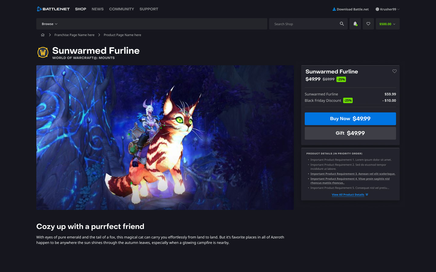
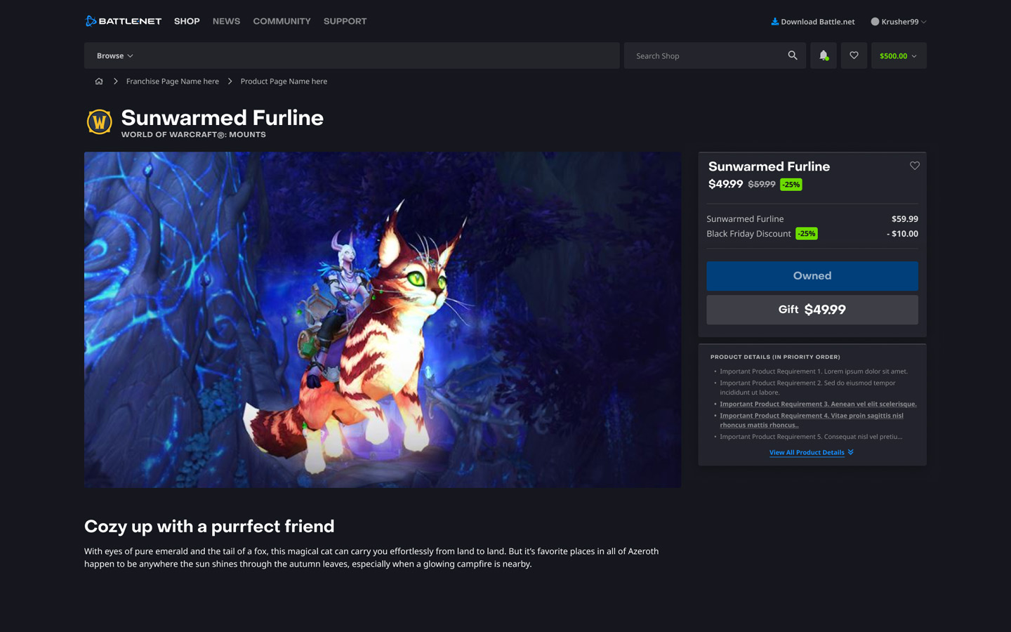
Purchase Flow Look
Once a user purchases one edition of a product, it impacts the price and legal information of the other editions. The new purchase flow includes updated information, displaying more accuracy for users to understand their purchases and any discounts applied.
Additionally, by replacing the primary CTA to "Owned," users can easily identify the products they already own without needing to check their purchase availability at the Checkout stage.
Single Product Design
Single Product Page
The single product page is simpler compared to the complex multi-product scenario. It only needs to display one product, either as available for purchase or already purchased.
Step 4
Component Update


Introducing New Components
Most of the new component work landed on the Purchase Panel and the New Image Display. The New Image Display was scheduled to ship first, ahead of the full redesign, because it was already needed for the MTX initiative.
User Testing
With the redesign paused for the MTX initiative, I folded this testing into the MTX user testing rather than running it separately. The direction validated there is what the design carried forward.
Final Thoughts & Takeaway
Where it landed
The redesign was paused in Q4 2022 when the team was redirected to the MTX initiative, and it had not shipped by the time I left Blizzard in 2024.
The question it opened stayed open. Nearly half of Battle.net Shop visitors reached a product page, and roughly the same share of them completed a purchase. Whatever the next attempt looks like, that gap is still the number it has to move.
What the work did produce was a validated direction and a decision trail: which regions the rollout had to be phased across and why, which stakeholder-workshop outputs survived scrutiny and which didn't, and where the purchase decision was actually being lost on the page. That research held after the project stopped.
What I'd Do Differently
I scoped this as a full page redesign. A full redesign needs a long, uninterrupted window, and a platform team's roadmap rarely gives you one. The parts I was most confident about, the ones that came out of testing rather than the workshop, could have gone out as isolated changes months before the pause and would have survived the reprioritization.
Now I ask early what the smallest shippable piece is, and whether the case for it can stand on its own if the rest never gets built.
Other Projects from Blizzard Entertainment




© 2026 Felix Choi Portfolio. All rights reserved.
Made with care and plenty of coffee
Contact
213 294 5690
hifelix.design@gmail.com
Open to new opportunities. Let's talk.
I'm open to opportunities that align with my visions.